Olddetroiter Member Username: Olddetroiter Post Number: 1431 Registered: 04-2008 |
I saw in the News today that the Detroit Lions are looking to change their logo. Is this a good idea? IMHO the logo is the only decent thing about the Lions. Keep the logo and change everything else. | ||
Baselinepunk Member Username: Baselinepunk Post Number: 70 Registered: 03-2007 |
Silver helmet ... Yep like that ... | ||
Dannyv Member Username: Dannyv Post Number: 532 Registered: 08-2007 |
Not unless they change it to the Cowardly Lion | ||
Smogboy Member Username: Smogboy Post Number: 6580 Registered: 11-2004 |
Get rid of Bubbles. That logo has no style, panache nor does it have a sense of ferocity. Some king of the jungle! Personally I wouldn't mind if they just went back to those throwback jerseys with NO logos on 'em. Keep it simple. And while we're at making changes... howzabout winning a few games this upcoming season? | ||
Rhymeswithrawk Member Username: Rhymeswithrawk Post Number: 1662 Registered: 11-2005 |
I think the logo should be something resembling this: http://www.gonemovies.com/WWW/ MyWebFilms/Drama/WizardLionClo se.jpg | ||
Rhymeswithrawk Member Username: Rhymeswithrawk Post Number: 1663 Registered: 11-2005 |
Darn you, Dannyv, you stole my thunder! | ||
Jtf1972 Member Username: Jtf1972 Post Number: 112 Registered: 08-2008 |
Personally, I think this classic should be the base logo: http://www.ocregisterfanshop.c om/Images/Product/51-42/51-421 24-B.jpg But I do like "Bubbles" on the helmet... just not in his current form. http://www.mghelmets.com/web%2 0site/lions-large.jpg The older, simpler style is better to me. Lose all the sissy striping & highlights. Go with a slightly darker blue. The Lions don't really need to do much to the uniform... just simplify As for the logos, two logos is fine. You have your standard logo and the one on the helmet. Many teams do this. | ||
Jerome81 Member Username: Jerome81 Post Number: 884 Registered: 11-2003 |
I heard they were gonna use this one... http://www.nopeitssoap.com/Ani matedPooSteamingCLR.gif | ||
Firstandten Member Username: Firstandten Post Number: 609 Registered: 05-2006 |
How about this ! Keep the logo and colors and change the managment. | ||
Blksoul_x Member Username: Blksoul_x Post Number: 435 Registered: 06-2007 |
I think 'Bubbles The Lion' is synonymous with ineffectiveness, so then perhaps the logo should be laid to rest for now. (even though I think the logo is one of the best in the NFL) Remember, in these parts, when we speak about a so-called 'logo change', it sparks memories of the horrific Grant Hill era Pistons teal and blue horses head concept!(Scary to say the least) As a long time Leo's 'cornbreader', I'm a bit sceptical about a new logo for our Lions! How about for now, we just give 'Bubbles' a leave of absence. blksoul_atcha! We are the ones we have been waiting on! | ||
Hornist9 Member Username: Hornist9 Post Number: 194 Registered: 05-2005 |
I remember a few years ago the Lions floated this very same idea. They came up with a logo that looked like an animator from Disney did it. I remarked on air to Art Regner on WDFN (I miss the Fan, dammit!) that it was perfect because the Lions are a Mickey Mouse organization (the quote was originally used by Wayne Gretzky to describe the Winnipeg Jets). Regner laughed and thought it was an excellent idea. Maybe now that they were 0-16, and following 8 horrible years of Matt Millen, and 45 years of inept Ford ownership, they ought to use that Mickey Mouse looking Lion. I wish I knew where I could get an image of it to show everyone. | ||
Gravitymachine Member Username: Gravitymachine Post Number: 1684 Registered: 05-2005 |
i personally like the stark silhouette of the current logo. i hope they don't change it to some cartoony looking thing like the jaguars or panthers | ||
Townonenorth Member Username: Townonenorth Post Number: 746 Registered: 10-2007 |
I like the silver helmet,it looks good when the throwback jerseys have been used lately. I also like the sleeker 60's style Lion.  | ||
_sj_ Member Username: _sj_ Post Number: 1651 Registered: 12-2003 |
That logo had nothing to do with the Lions. It was part of an artists portfolio and the internet took it from there. Unless they planned these changes back in November nothing will happen until 2010. And I think the only change will be the removal of black and maybe a darkening of the blue. | ||
Townonenorth Member Username: Townonenorth Post Number: 747 Registered: 10-2007 |
Try this link to E-Bay, 1969 2 stickers from the Lions. lions Stickers 1969 | ||
Gnome Member Username: Gnome Post Number: 2283 Registered: 08-2007 |
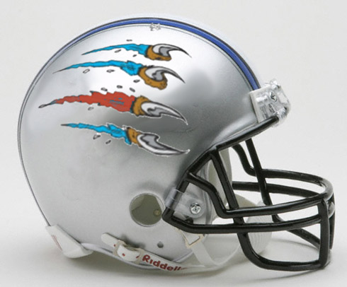 time to think in a whole new way | ||
Bigb23 Member Username: Bigb23 Post Number: 3575 Registered: 11-2007 |
Love it Gnome - throw a couple more on ! | ||
Gnome Member Username: Gnome Post Number: 2284 Registered: 08-2007 |
 by a former fan | ||
Denbytar64 Member Username: Denbytar64 Post Number: 113 Registered: 03-2008 |
They better change something before the team moves to Los Angeles or any other city. | ||
Denbytar64 Member Username: Denbytar64 Post Number: 114 Registered: 03-2008 |
They better change something before the team moves to Los Angeles or any other city. | ||
Gencinjay Member Username: Gencinjay Post Number: 105 Registered: 03-2008 |
Why would they move? They've had it made here for years. This is the first time they've had to deal with multiple games not selling out. All they have to do is show some improvement and the fans will all be back. The NFL would not allow them to move. | ||
Eastsideal Member Username: Eastsideal Post Number: 249 Registered: 10-2007 |
They shoould go back to the logo they used when they were one of the dominant teams in the NFL and won 3 championships in the '50s. 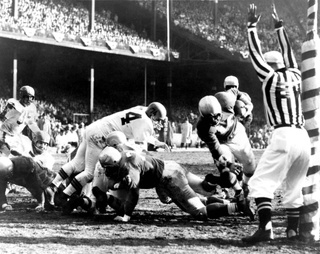 1957 NFL Championship Game Dec. 29, 1957 Lions vs. Browns Briggs Stadium Detroit 59 Cleveland 14 Gaze and weep... | ||
Lostlegumes Member Username: Lostlegumes Post Number: 81 Registered: 09-2007 |
This should make people understand http://www.dizpins.com/archive s/images/2006aprilpics/wdw_hid den_purple_ears_041006.jpg | ||
Jonesy Member Username: Jonesy Post Number: 527 Registered: 07-2005 |
 | ||
Fnemecek Member Username: Fnemecek Post Number: 1899 Registered: 12-2004 |
quote: Amen. | ||
Ltdave Member Username: Ltdave Post Number: 325 Registered: 09-2006 |
get rid of the black accents... i know that if you have black it makes you 'bad' but for cryin' out loud! dont take it so literally... i HATE adding black to the uniforms. my high school did that and it looks like crap. honolulu blue and silver is the only colors in want to see on the colored jerseys and add white for their away uniform... | ||
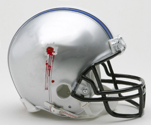
Spitty Member Username: Spitty Post Number: 294 Registered: 07-2004 |
This just about says it all... 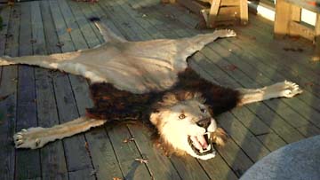 | ||
Bigb23 Member Username: Bigb23 Post Number: 3576 Registered: 11-2007 |
I'm not talking hairstyles, but....... 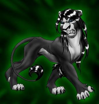 http://fanart.lionking.org/Artists/hibbary/SnapeLion.jpg | ||
_sj_ Member Username: _sj_ Post Number: 1654 Registered: 12-2003 |
quote: No it isn't. | ||
Rjk Member Username: Rjk Post Number: 1129 Registered: 11-2003 |
http://cache.gettyimages.com/x c/53354018.jpg?v=1&c=ViewImage s&k=2&d=17A4AD9FDB9CF1939847EC 77F5F8D1CEDD8788FBDF90E5A1A40A 659CEC4C8CB6 I'd put this nincompoop on the side of the helmet so no one forgets who has been in charge of this 40 year mess. |