Fury13 Member Username: Fury13 Post Number: 1277 Registered: 10-2003 |
I just saw one of the new white standard Michigan plates today. Anyone else seen one? Opinions? (I liked the old blue one better.) | ||
Crash_nyc Member Username: Crash_nyc Post Number: 724 Registered: 08-2004 |
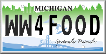
"Old blue" graced every car that I owned during my years living in Detroit, so it'll always be a piece of nostalgia for me. While I thought the previous alternative to the blue plate was atrocious, I like the new designs. I couldn't help but notice that the "Spectacular Peninsulas" plate shares a few design elements with our plates here in New York. 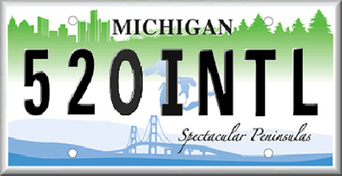 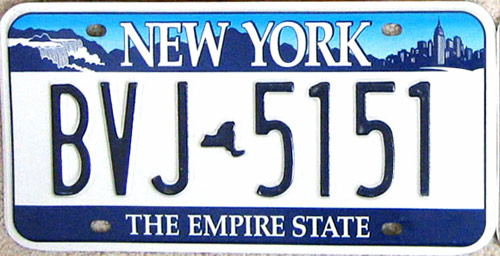 | ||
Futurecity Member Username: Futurecity Post Number: 438 Registered: 05-2005 |
I wonder where the yearly tabs will go...will they cover the city...the trees...or part of "peninsulas"? | ||
Hysteria Member Username: Hysteria Post Number: 2068 Registered: 02-2006 |
This thread regarding the new plate was pretty funny: https://www.atdetroit.net/forum/mes sages/76017/78225.html | ||
Yaktown Member Username: Yaktown Post Number: 84 Registered: 02-2006 |
Will this be Lowell's new plate?  | ||
Fury13 Member Username: Fury13 Post Number: 1278 Registered: 10-2003 |
Talk about spectacular penises notwithstanding, I was referring to the new standard white plate pictured above. Pretty bland, and inferior to the old Lake Superior blue plate, if you ask me. No reflective background on that blue plate? Awwww. Just DEAL with it, coppers. And including "www.Michigan.gov" at the bottom of the new plate is so passe. What? The state has an Internet site? Gee whiz! Wow! Including the state's Web site address might have been pushing the envelope in 1996 or so, but these days everyone's on the Internet using search engines like Google, and it's easy to find any site you're looking for. "www.Michigan.gov" would be anyone's best educated guess anyway. "Great Lakes" at the bottom of the plate as a slogan (or "Water Wonderland," which was used back in the '60s) would have been just fine. | ||
Ray1936 Member Username: Ray1936 Post Number: 1038 Registered: 01-2005 |
How 'bout this slogan, Fury? (Apologies to Yaktown!)  | ||
Jerome81 Member Username: Jerome81 Post Number: 1241 Registered: 11-2003 |
Agreed. "Great Lakes" should have been left. While I don't live in michigan, I would have taken the old blue over the Mackinac, but i think I'll take spectacular peninsulas over the new standard issue. Yuck. | ||
Thnk2mch Member Username: Thnk2mch Post Number: 587 Registered: 02-2006 |
 | ||
Ray1936 Member Username: Ray1936 Post Number: 1039 Registered: 01-2005 |
Would love to see that one on the back of an Escalade, Thnk2mch!  | ||
Gistok Member Username: Gistok Post Number: 3415 Registered: 08-2004 |
... and then there's Wisconsin's license plate... who's motto should be "Smell My Dairy Air"... | ||
Jerome81 Member Username: Jerome81 Post Number: 1247 Registered: 11-2003 |
This is still the best damn one: https://www.atdetroit.net/forum/mes sages/76017/78246.jpg | ||
Fmrdtwn Member Username: Fmrdtwn Post Number: 13 Registered: 07-2005 |
WW4FOOD, its getting that way! | ||
1953 Member Username: 1953 Post Number: 1267 Registered: 12-2004 |
What is that sharp edged building in the middle of the Detroit skyline on the New York-like plate? | ||
Bob Member Username: Bob Post Number: 1311 Registered: 11-2003 |
Two big reasons they switched from Old Blue to the new white ones. #1: white background with blue letters are easier for law enforcement to read from a distance. And #2: this helps weed out people who are using expired plates with fake tabs. They are forced to get a new plate. | ||
Ro_resident Member Username: Ro_resident Post Number: 198 Registered: 11-2003 |
There are some strange things going on with the latest series of license plates. Since the state adopted the latest series of numbers, three letters and four digits (AAA NNNN), there have been inconsistencies with the format. This goes for the old blue plate and the new white plate. You will see plates with the numbers and digits mashed together (AAANNNN), others have a gap (AAA NNNN). Some of the plates with the gap have a smaller and boxier font. On top of that, sometimes it appears the 2 and the Z are in a different font than the other characters of the same plate. Back to your regularly scheduled programming.... | ||
Mackinaw Member Username: Mackinaw Post Number: 2353 Registered: 02-2005 |
1953, I'm not sure. I'm pretty sure they melded together the skylines of Detroit and Grand Rapids, which is just stupid. | ||
Ro_resident Member Username: Ro_resident Post Number: 199 Registered: 11-2003 |
Buildings are: State Capitol Building in Lansing Renaissance Center in Detroit Alticor Building in Grand Rapids The Genessee Towers in Flint http://www.michigan.gov/sos/0, 1607,7-127-1640-149152--,00.ht ml I could have sworn that was Joe's Bar in Alpena to the left of the Ren Cen. | ||
Gravitymachine Member Username: Gravitymachine Post Number: 1483 Registered: 05-2005 |
hate the new plate, like crash-nyc said, pretty damn close to the NYS plate...which sucks because I was happy to get that ugly plate off of my car when i moved here | ||
Burnsie Member Username: Burnsie Post Number: 834 Registered: 11-2003 |
I did some completely non-scientific and biased observations the other night, and the Lake Superior Blue plate is just as easy to read, if not easier, than the newer ones. Really, it is! The real problem is with dumbasses that let layers of dirt cover the plates so you can't read them no matter what type they are. It's interesting that the font on the blue plate has been in use since circa 1942. I always liked its beefy, no-nonsense look which seemed appropriate to the state. The newer font is lame, but not as lame as putting the website name on the plate. From http://www.sos.state.mi.us/history/autoshow/l_plates/images/1942-43b.gif 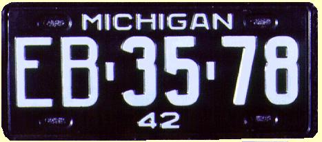 | ||
Burnsie Member Username: Burnsie Post Number: 835 Registered: 11-2003 |
I should have clarified that the font used for "MICHIGAN" (not the big alphanumeric font) hadn't changed since '42. | ||
Scottr Member Username: Scottr Post Number: 182 Registered: 07-2006 |
I wish they had used the mott foundation building for flint rather than genesee towers - especially since there is talk of tearing that vacant eyesore down. Besides that, which one is it? none of them really look like it, unless it's one of those short block looking buildings. Not a very good representation. I also wonder why they used a completely different font for 'www.Michigan.gov' than they use on their website. it's lame anyways, a decade too late. should have kept 'Great Lakes' | ||
Fury13 Member Username: Fury13 Post Number: 1308 Registered: 10-2003 |
Ro_resident: When the Secretary of State first went to three letters and four numbers on the blue license plate, circa 2005, a seven-digit die set was used, so there was no room for a space between the letters and numbers. I believe that it was somewhere in the AFP letter-combination sequence that the plates changed to an eight-digit die set (narrower letters/numbers) with a more squared-off look. The eight-digit die set was retained for the new standard white plate and allows longer personalizations as well as a space between the letters and numbers. The blue plate's letter sequence got as far as AJS or so, and the earliest letter sequence I've seen on the new white plate is BCX. The latest one I've seen is BGG. All sorts of national license plate info at http://www.licenseplates.cc/. | ||
Fury13 Member Username: Fury13 Post Number: 1309 Registered: 10-2003 |
Another thing: the new white plate has some sort of hologram built into it, presumably for security or anti-counterfeit purposes (hmmm, wonder if it's some sort of tracking device for use by the cops?). | ||
Burnsie Member Username: Burnsie Post Number: 836 Registered: 11-2003 |
Scottr-- In the plate, Genesee Towers is supposed to be the building with the penthouse, immediately left of the hole. I ventured into Genesee Towers with a friend several times during summer 2001, when only a couple of tenants were left. Most floors were vacant, and there were abandoned cars on the top level of the parking structure. On floor 10, there were still nameplates for NBD employees and various trash & junk strewn around. A stuffy, disagreeable smell was settling in. God knows what the place looks like inside now. The last tenant moved out some time ago. Most of the time, the only lights visible in the building are the red aircraft light (I remember when it was a searchlight!) and some lights by the lobby door. Late last summer, I was driving by the building and heard loud music coming out of an open window! The slumlord that owns it maintains that the city of Flint holds a personal vendetta against him. | ||
Scottr Member Username: Scottr Post Number: 183 Registered: 07-2006 |
yeah i figured that, but it looks more like one woodward to me - either the penthouse is too big, or the building's too narrow for it to be genesee towers. but i guess expecting some semblance of accuracy is too much. personally, i don't blame the city if they do have a personal vendetta against him. everything i've heard about the building from the past few years sounds exactly like you described. he appears to be making no attempt to return the building to a usable space. | ||
Ltdave Member Username: Ltdave Post Number: 29 Registered: 09-2006 |
i have a Superior Blue veteran plate. i got it in 1992 when i separated... i know they will be sending me a new blue on white plate with that neato Michigan slogan "www.Michigan.gov" but im wondering if it will be the same letter/number combination. ive had it for 14-1/2 years now, and i like it... david |